Here’s Looking at You
 Visual concept: It was important to Parker—and its NYC branding agency, Ideon—to celebrate the organization’s history while looking forward. The goal was to represent Francis E. Parker’s commitment to family, community, and service, and visually preserve the past while bringing that vision forward to the modern day.
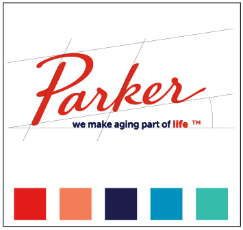
Logo “Lock-up”: Parker’s name and tag line support one another and are meant to be seen together. Our tagline, “we make aging part of life,” which is also our vision, nods to what Parker is doing on a national thought leadership level, in addition to operationally. The word “life” appears in the same color as “Parker”; a visual echo that indicates how Parker embraces life and also suggests how the experience of “Parker life” differs from anywhere else.
Signature: From royal seals to the Declaration of Independence to today, a signature signifies something a person believes in, honors, and validates. Using cursive suggests Francis E. Parker’s seal of approval; the handwritten feel of the font symbolizes ownership, value, and the kind of personalized care for which Parker is well-known.
The Parker Edge: The 15-degree angle of ascent comes as a visual rebuke to misconceptions that getting older means growing more stagnant and sedentary. Our signature moving upward from lower left to top right suggests activity, hope, and aspiration.
Color: We selected poppy as our primary color because it captures Parker’s values: creative, enriching, and vibrant. In addition, this bold and rousing color is the opposite of the clichéd, soft, pastels we see in the aging services space. For our secondary color, we chose iris navy blue to speak to Parker’s rich history and legacy.

